
Andrea Alstad presents some helpful tips on using paper choices to add interest to your design in her article "Layering Color to Add Depth, Interest to Your Design".

Andrea Alstad presents some helpful tips on using paper choices to add interest to your design in her article "Layering Color to Add Depth, Interest to Your Design".

The font choices for web design have gotten a lot more expansive, thanks to services from companies like Fontdeck, Webtype, WebInk, Web Fonts, and Typekit. These companies provide an online library which is accessed by brief snippets of code, provided when you pay to use the service. How's technology columnist, Stephen Beale, provides a review of the five services mentioned above in his article "Technology Review: Web Font Services".


Share your iPhone on a larger scale with tableconnect...when it gets here. A prototype is available for viewing, and its pretty nifty

Artylizer is Social Media that lets you enjoy and share your favorite art, ideas and creations.
You can:
- post short text messages (up to 333 characters),
- attach/embed images
- add links to your messages (youtube and vimeo links are auto-embed)
- point location on map
- subscribe to other users' feeds and send them messages
- perform creative design & art for sale
The perks:
Each month, users with the most subscribers will get a special promotional package of their artylizer profile page on Facebook, and receive gifts from artylizer sponsors.

Do you suffer from social media mania? Do you constantly tweet, or update your Facebook status? Can you manage to do without it for just one day? Today would be a great day to give it a try and simultaneously raise funds and awareness for Autism worldwide. Communication Shutdown 2010 will provide a CHAPP (charity app) for a minimum donation of $5 that advices your Twitter followers and Facebook friends of your decision to remain 'silent' for this one day in support of the autism cause.

"A single day represented in 100 photographs." "The 1010 project was devised as an antidote to everything in modern life always having to be bigger, better, louder and brighter than what’s been before." "10 photographers. 10 photos each. All taken on 10/10/10."

Graphic Designer, Art Director and Photographer, Alex Becker has an eye for the extraordinary within the ordinary. His site, Things I Saw Today, features out-of-the-ordinary items in ordinary circumstances that some might walk by without so much as a second glance.

The HTML5 family (HTML, CSS, JavaScript, SVG and others) is making strides to push Flash out of the picture. You can stylize fonts without adding images, create photo galleries that don't require a third-party plug-in, incorporate 360 degree elements, integrate video right into your code, and a host of other things that make your HTML site appear very Flash-like. Apple, Google and Microsoft have created extensive showcases about what HTML5 can do for you. Don't get too excited though, according to David Bliss of odopod "Right now, Flash remains the better choice for rich, immersive experiences."

Goodbye Lorem ipsum, hello Fillerati! A brain-pleasing alternative to meaningless filler text, Fillerati is a site that allows designers to pick an author, and a selected piece of work, then create paragraphs, headers, lists, or just a few words to use as placeholders in works in the making.

Exquisite and ingenious is the best way to describe these city maps by Axis and world maps by Typomaps....a must see for type lovers.

There's nothing better than a visual solution that simplifies complex data. If you want to "[Make] sense of complex issues through data and design" visualizing.org is the place to go. Want a better understanding of the scope of the damage created by the oil spill, how about what will happen to the world if greenhouse gas emissions are not curbed? You could read about it, or get the 'cliff notes' at visualizing.org.

Diamond, Platinum, Gold, Silver and Bronze, attractive precious metals and stone, and the categories for this year's Pentaward Package Design winners. It is so much more difficult to pass up those unnecessary items when the outside is as sleek, sexy, fun, unusual, or just downright brilliant as these.

Here's a fun game for the hard core typographer...or anyone who wants to be a hard core typographer - The Quick Brown Fox Jumps over the Lazy Dog (a Typeface Memory Game designed by ps.2 arquitetura + design) tests your recognition of different font types and teaches you a little about the typeface. Game night anyone?

Any information you could ever want is readily available somewhere out there in cyber space. The trouble is sifting through all the unrelated information the search engine pulls up to find what you want. Xerox thinks they have found the answer to the information overload syndrome portrayed by Bing in their television commercials. Trailmeme, 'a new kind of publishing', allows users to create meaningful patterns in web content. You can blaze your own trails, and benefit from the trails of others.

Care to take a guess at the selections for this year's Communication Arts Ad Annual? Here's a hint, it won't be any of the nominees for The Consumerist's Worst Ad in America 2010. Voting ends tomorrow (September 28), if you want to add your voice.

In the October Issue of Print Magazine the article "The Art of Seduction" reveals some of the sneaky tactics designers use to get those "intractable, unimaginative, chronically contrarian, colorblind, or just plain grumpy clients" to say 'yes'. You would have to be pretty gutsy to pull off some of these tactics, but they are nonetheless funny, non-pedagogic lessons that design students may chose, or not choose, to store for future use.
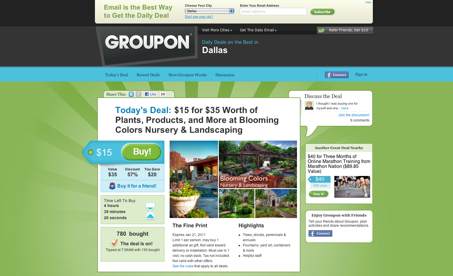
In his article "Who Needs Agencies?", Brian Morrissey exposes the increasing popularity of Groupon for marketing needs. Social platforms appear to be taking over every aspect of life these days, but can they be used to eliminate the need for advertising agencies? That idea is about as grandiose as desktop publishing eliminating the need for Graphic Designers.


If you've travelled outside of the U.S. you've likely had to exchange your standard green bills for what looks like 'funny money', as most of the world's currency varies in color and size according to the denomination of the bill. In "The Buck Stops Here" Steven Heller posits that designers have questioned the aesthetics of U.S. currency, and points towards suggested redesigns created in "The Dollar ReDe$ign Project". If implemented, any of these could be a welcome change for tourists and the visually impaired.


