The Woes of Photoshop Slop
Most of us are familiar with Photoshop Disasters, but Yahoo's OMG and Boing Boing also feature commentary and images of Photoshop Slop. The latest mishap is the photo of Demi Moore on the cover of W featuring a missing slab of her left hip! And earlier this year, Boing Boing also dissed Calvin Klein's creepy image of Fillipa Hamilton. I am waiting for an entire ad campaign to break using overly Photoshopped images as a parody. MARGARET SMOLEN / JOE SILVERMAN :: CONTRIBUTORS.
Double Take
"35 Smart Logos To Make You look Twice" by Dainis Graveris features logos that incorporate some of the best visual communication qualities - visual metaphor, figure/ground and more. MONICA MILLER :: CONTRIBUTOR.
Nerd Merit Badges
From one of the collaborators on Meatcards, John Young offers Nerd Merit Badges. Show off your geek street cred by collecting all of these on a nifty sash for your laptop.
Design You Can Sink Your Teeth Into
Meatcards, a collaborative effort of Randy Schmidt, Christopher Thompson and John Young, are business cards seared onto jerky with a CO2 laser. Think of high-tech cattle branding. The prototyping process involves laser tables, Corel Draw software and a uniqueness that "does not fit in a Rolodex, because their deliciousness CANNOT BE CONTAINED in a Rolodex." :: JOE SILVERMAN, CONTRIBUTOR.
Type Trumps
Another great gift idea for the fellow designers in your life - Type Trumps designed by Rick Banks. Each card is designed to make the most of the particular font it features. Type Trumps players can battle it out using such statistics as year of design, the amount of weights, cost etc to win their opponent's cards. :: HEATHER ABBOTT, CONTRIBUTOR.
This Campaign Cost Nothing
The Salvation Army of Northern New England recently launched a pro-bono campaign to create awareness of the agency's services. The entire campaign was done for FREE - creative and media space [online, tv, print] were all donated. Guerilla media was also used and uniquely tailored to each business. :: CREATIVE QUARTERLY, NO. 16
Typography Geography
Rhett Dashwood [cool name] of Australia has spent some spare time from Oct 2008 though April 2009 searching through Google maps of local areas for land formations, urban sprawl and buildings that resemble typographic letter forms. Clicking on the letters below his grid of the alphabet takes you to the exact locations of the letter in Google maps where you can zoom in or out and explore on your own. :: CREATIVE QUARTERLY, NO. 16
Flip Out
Flip out with your own FlipScript Ambigram that can be read right-side-up or upside-down. Use any name, combination of names or your imagination to create a custom script of your own. This site offers a variety of applications if you like your FlipScript - including t-shirts. :: UCDA DESIGNER MAGAZINE, SUMMER 09
World of Trouble for WWF
DDB Needham Brazil designed this ad for The World Wildlife Fund... followed by all Hell breaking loose. The ad features a herd of planes aimed at the Twin Towers and copy that compares 9/11 to a tsunami. Furthering the offensiveness, DDB also created a video which managed to be entered into the Cannes Festival. In the midst of public outrage, finger pointing, agency and client backpedalling, Barbara Lippert of Adweek gives an excellent analysis of the "batshit-crazy situation" in the ad industry.
IKEA + Verdana = ?
In case you have not heard, IKEA has changed its corporate type style from a form of Futura to the ubiquitous and Microsoft-created – Verdana. Grumbles and backlash over the change have been all over the web. TIME posted an article on the many reasons why the switch has customers and designers in an uproar worldwide. Vitaly Friedman, editor in chief of Smashing Magazine says that IKEA's former typeface reflected the brand's design philosophy and the switch creates a loss of originality and credibility. On the opposing end, Christopher Simmons of Advertising Industry Newswire says that IKEA has built a great brand worldwide and are listening to their core market (along with the economy) by switching to a type style that speaks to "young adults buying their first EXPEDIT, JAVNAKER, or KVART, who have more experience reading their iMac screen and MySpace page than they do reading the New York Times..." The question remains for the switch– business savvy or type travesty? Will the IKEA type style change become the New Coke? ZACH SHIRLEY :: CONTRIBUTOR
Alien Smart Image Retargeting
This amazing video demonstrates technology by Shai Avidan of the Mitsubishi Electric Research Lab and Dr Ariel Shamir. With content-aware "smart" image sizing technology, images can be retargeted to fit a multitude of sizes – and here's the amazing part – without ANY distortion. More space-age research can be found at Dr Shamir's website. MONICA MILLER :: CONTRIBUTOR
Cassette Tape Coolness
Check the work of artist iRI5 who has constructed portraits of musicians (and others) from cassette tape. Recycling never looked so good.
Get Ripped!
Check out riptionary.com for contemporary and historical surf lingo. You will be surprised by how much of our everyday language has been influenced by surf culture. Even if you have never caught a wave yourself, learn how to describe wrapping, on-rail turns, vertical attacks and above-the-lip moves with the words of a core surfer rather than a land shark.
Wahine Surfers
Still in sunny Florida - and enjoying snorkeling, kayaking and watching Surf Camp. Two of the four surf instructors are women, Christine and Megan. Christine had both her daughters, 1 and 5, in the water. While her one year old is not surfing yet, she is on Christine's hip in the water constantly. I was inspired by both surfers and thought I would share some links about women or "wahine" surfers: Women Surfers, History of Women Surfers, Great Women Surfers of the Wooden Era, EastCoastWahines.com, and some photographs by Elizabeth Pepin who has been photographing women surfers in California for 20 years.
Sequence Surf
Getting ready to take my annual trip to Florida, and I thought some surf installments on the blog would be fun. I will try to keep them design or photo related, of course. For starters, check out club of the waves. This site has a killer section on surf photographers – Ben de Camp and Andrew Shield are two of my favorites. Another link for great visuals–this time video– is surfline. Click on the "sequence of the week" - after the video loads, you can "scrub" it back and forth by rolling your mouse over it, and see each frame of the action.
Suite Dreams
For the ultimate Adobe junkie, pillows featuring the Adobe Suite logos. And even if you don't get to use them much for sleep, they work great as backrests while you pound away the night on your laptop. JORDAN WITT :: CONTRIBUTOR.
When Bad is not Good
Please step away from the Mac with your hands up! This link leads you directly to the Design Police where you can download your own Visual Enforcement Kit to place fellow designers under citizen's arrest if necessary. With commands such as "Kern this!", "this type has been bastardized", and "WIDOW" placed in label sized cutouts, anyone can become an officer of design law. JORDAN WITT :: CONTRIBUTOR.
Famous for Free Fonts
Ray Larabie used to give his fonts away for free. Now, as the head of Typodermic foundry, his fonts are some of the most popular of MyFonts libraries. Without brushes, sketches or pencil, Larabie begins his craft on the computer - with a trackball. Read the full interview and take a look at his creations. GIGI GREGG :: CONTRIBUTOR.
Don't be a Hater
I never stopped to think about the person who invented one of the most despised and ridiculed typefaces. But Vincent Connare, as the creator of Comic Sans, appears to have accepted his fate and has a good time with it. Here he is performing a standup routine about his infamous typeface at ROLFthing in New York. Also a great article on him in the Wall Street Journal and more on his blog. Thanks to Kate Hogan for contributing.
Much More than Doodles
For a recent issue of Los Angeles, art director Joe Kimberling collaborated with Marian Bantjes to create the cover. The result is a notebook cover filled with doodles done entirely in ballpoint pen inspired by a creative, but bored high school student (source: Creative Quarterly Magazine, No. 13). The most incredible example of ballpoint pen work I have ever seen in person was a huge work on canvas by Andrei Molodkin [20' x 8.5'] done completely in blue ballpoint pen at Kashya Hildebrand Gallery, New York. Does anyone know of any other artists/designers who use ballpoint pen? How about a typeface created from this?
And I quote...
Fantastic quotes from Paul Rand can be found in one of Steven Heller's new books, Paul Rand: A Designer's Words. It features a collection of quotes and comments from a variety of presentations, conferences and interviews of the famous designer. And it's free and downloadable as a .pdf file. So print it out and paste a quote on each day of your calendar for inspiration.
Samarai Style Interactive
The web sites for Morimoto and Buddakan restaurants take Asian cuisine to a new level through their design. Buddakan elegantly joins separate images from the restaurant architecture and the cuisine to create sophisticated pairs that also feature text floating into the frame on rollovers. Morimoto, on the other hand, jumps onto the screen on entry using imagery sliced and diced like sushi with New York cabs, traffic lights and crab legs mixed in. Thanks to Gigi Gregg for these links!
Walmart Brands Makeover
I am back! After a record 20 day absence - so happy to be back blogging.
And back to more commentary on package design. From Joe Silverman, check out Walmart's redesign of its own generic/store brand. It is interesting to note the ways that the economy has affected design thinking for both of these big brands. Tropicana risks its brand value by trying to adopt a generic-influenced style, and Walmart enhances its brand value by adapting cleaner, more contemporary design. Links to articles: Reuters and North Carolina News-Record.
New & Improved Tropical Brain Farts from Pepsi
My students have actually laughed out loud over Pepsi's recent antics with rebranding. This time the Arnell Group deflates Tropicana's orange and straw logo and features Peter Arnell stammering through a justification of the new design with words like "So we thought it would..." and "to try to give a new..." Call me crazy, but when a company is spending billions on rebranding, you need to know it will be successful. The new designs will be yanked from the shelves, and the orange will be making a comeback. Thanks to Zach for contributing.
Women of Design
Inspiring web site which showcases and promotes the new book "Women of Design". The book divides women designers into three categories: Trailblazers, Pathfinders and Groudbreakers and the site features a sidebar with links to each of the designer's web sites. Also featured are a few spreads from the book.
HOPE Still in Hot Water
PDNonline.com, the New York Times, and NPR's Fresh Air feature stories on the continuing legal storm surrounding Shepard Fairey's famed "HOPE" poster featuring Barack Obama. The AP, photographer Mannie Garcia, and Fairey's attorneys are swimming in a legal soup of plagiarism, copyright infringement, and permissions. And an interesting analysis of Fairey's work can be found on Mark Vallen's Art for a Change website. Fairey has created a lucrative brand for himself - one that many people believe in. Does anyone else find it ironic that this anti-establishment artist has become a corporation himself?
Typographic Posters
A second installment from Monica Miller's list of killer links takes us back to Smashing Magazine for an article on Breathtaking Typographic Posters. These examples illustrate the elastic qualities of type and the numerous ways it can transform and transcend.
Judge a Book by Its Cover
This link to inspiration through Smashing Magazine showcases book cover design from past to present. Featuring designs by Paul Rand, Alvin Lustig, Gregg Kulick and more, these timeless graphics embody conceptual prowess at work. A special thanks to Monica Miller who sent this and many more fantastic links - so stay tuned. Monica will be your creative guide in the weeks to come as I plow through course lists and grading!
Pepsi's Brain Fart
This link at AdFreak takes viewers to some great commentary on the absurdity behind the advertising pitch and the 'logic' behind the new Pepsi logo. FastCompany labels it "brand lunacy to the max" and BrandFreak describes the new logo as the result of smashing together the logos of Barack Obama and Korean Air. Thanks to Joe, Zach and Chambley for this!
Typographic Biology 101
Typorganism.com offers a variety of ways to make your own type creations. Under description, the site states its manifesto: "Type is a Lifeform" which lives on the Net, responds to viewer stimulus, evolves through time, has intelligence and is powered by computational algorithm. This series of communication experiments driven by computational interactive design and interactive kinetic typography is based on the metaphorical notion of typography. Viewers can select from menu choices such as "DNA", "Motion Sickness", "ASCII-O-Matic" and more. Grab your safety glasses, lab coat, and get creative - thanks to Richard Klein for this link.
Perfected Packaging
This link from Jordan Witt - some outstandingly unique and original package design. Everything from energy drinks to boxed wine to microwave meals. Some great inspiration for those of you ready to take on packaging design.
Objects of Typographic Desire
Just in time for Valentine's Day, this link to objects you will love - all made out of type. Everything from tables to pillows to belt buckles - thanks to Katy Hale!
Washdays
Megan Hildebrandt is a resident artist at the Creative Alliance in Baltimore and every Saturday she goes out into her neighborhood and scrubs marble steps. A painter and performance artist, Megan is interested in American history and experience. For this project she is reenacting Aubrey Bodine's photograph, "Washday" which documents housewives and children scrubbing the steps on Saturday mornings during the 1930's - 50's. Click here for the video.
Super Bowl Commercials: The Good, the Bad and the Ugly
Mag Cloud
Last semester in Publication Design class, I discovered a Beta site called MagCloud where anyone could publish their own magazine for a low cost - up to 20 pages for as little as $4.00 an issue. One of our classmates, Judith Trevino, took this site to heart and created a magazine for her church's youth program for girls. Check out the premier issue of True Beauty.
Party on the Catalog
Check out this interactive piece HEMA from the Netherlands. Just be patient and what appears to be an online catalog will begin to transform... very clever!
Eating Like College Students
With the economic downturn, American pasta makers are reporting record sales. Gone are the days of fancy no-carb diets as more and more consumers return to the food groups utilized by most college students - cheap ones. All hail Ramen noodles and the old reliable, mac & cheese!
Most Valuable U.S. Retail Brands for 2009
When we discussed brand value last semester, several of you did searches on the top U. S. brands and their value. One of the largest brand consultancies, Interbrand, has released this report on the most valuable U. S. Retail Brands for 2009. Not surprisingly, Walmart leads the pack with over six times as much value as its closest contender, Best Buy.
What the Font?
From one of our Typography classmates (thanks Monica!), this rockin' link to some killer typefaces MyFonts.com. Be sure to click on the link for the new web site - it has even more links, a newsletter, and lots of info for typophiles like us.
2008 Best Magazine Covers
The American Society of Magazine Editors has announced the 2008 Winners for the best cover design competition.
Courier kidnapped by Ransom
A former colleague of mine sent me this link. It is a hilarious video titled "Font Conference" where actors portray fonts (typefaces) at a conference where the membership of Zapf Dingbats is being discussed and voted upon. But, in the middle of proceedings, Courier is kidnapped by the dasdardly Ransom and... well, I don't want to spoil the ending. This is a great piece of work - not only for the concept, but the dedication of the students who crafted it. See the video at College Humor.
Raising a Fist for Retail
New ads by Shepard Fairey for Saks Fifth Avenue reveal a Russian Constructivist slant. Is this Saks' response to hard economic times? See Steven Heller's analysis and more Constructivist inspired ads, including Stoli, at The Daily Heller.
Graphic Design-y Tatts
A recent issue of Print Magazine lists an online gallery of some graphic design related tattoos. You can see all of them at the Graphic Ink.
51 Creative Business Cards
This site offers images of 51 - yes, I said 51 - business cards that will make you look and think twice. Some are a bit too complicated or costly, but all are VERY creative and reflect the personality of the maker/owner. See them all on quicksprout.com
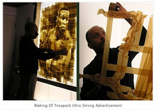
Tesapack's Tape Masterpieces
For all of you who struggled last semester with your concepts for 3M Duct Tape, this campaign will put your suffering to an end and make you wave the white flag of surrender. This is the ultimate solution in creating tantalizing tape - Mark Khaisman created these artistic masterpieces. More on Brandinfection.com
Freaky PSA for Skin Cancer
After spending time on the beach during break, and as usual, getting some type of sunburn, I found this creepy PSA fitting. It features the Australian rapper Al Bino and a rapping, snaggle-toothed cancerous lesion - Eeewww. Check it out and don't forget the sun block. By Tim Nudd on Adfreak.com
Subscribe to:
Posts (Atom)